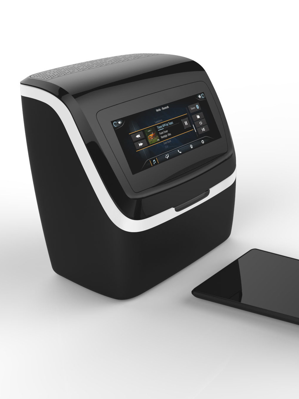
In 2011, Johnson Controls joined with Mazda in a co-development of the pilot MazdaConnect infotainment system. The JCI team developed a broad UX strategy, interaction model, and visual theme that strengthened the OEM brand. The first Mazda3 with Mazda Connect rolled off the line in 2014. The system was then proliferated across the Mazda line and customized for Scion and Fiat.
The system was optimized to give users easy access to entertainment, driver information, and communication functionality within the driving environment. MazdaConnect was specified to have a 7” touch screen. However, a rotary command knob (à la BMW iDrive or Audi MMS) was selected as the primary input modality due to better performance in driver distraction tests.
REDUCES EYES-OFF-ROAD TIME
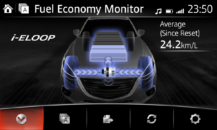
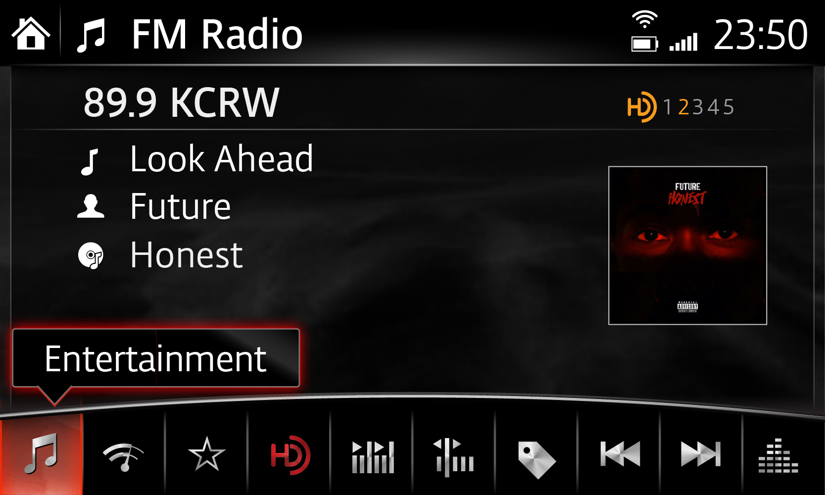
The rotary controller reduces eyes off road time but increases the number of glances required to complete a task. Placing the buttons along the bottom of the screen allows for intuitive mapping with the controller and allows the driver to anchor their hand on the dashboard when using the touch screen. The UMP (Universal Media Player) is a UI feature that allows the user to control many types of content using the same structure to maximize touch accuracy and content area. Curved lines mirror the rotary controller.
INFORMS DESIGN AND INTERACTION
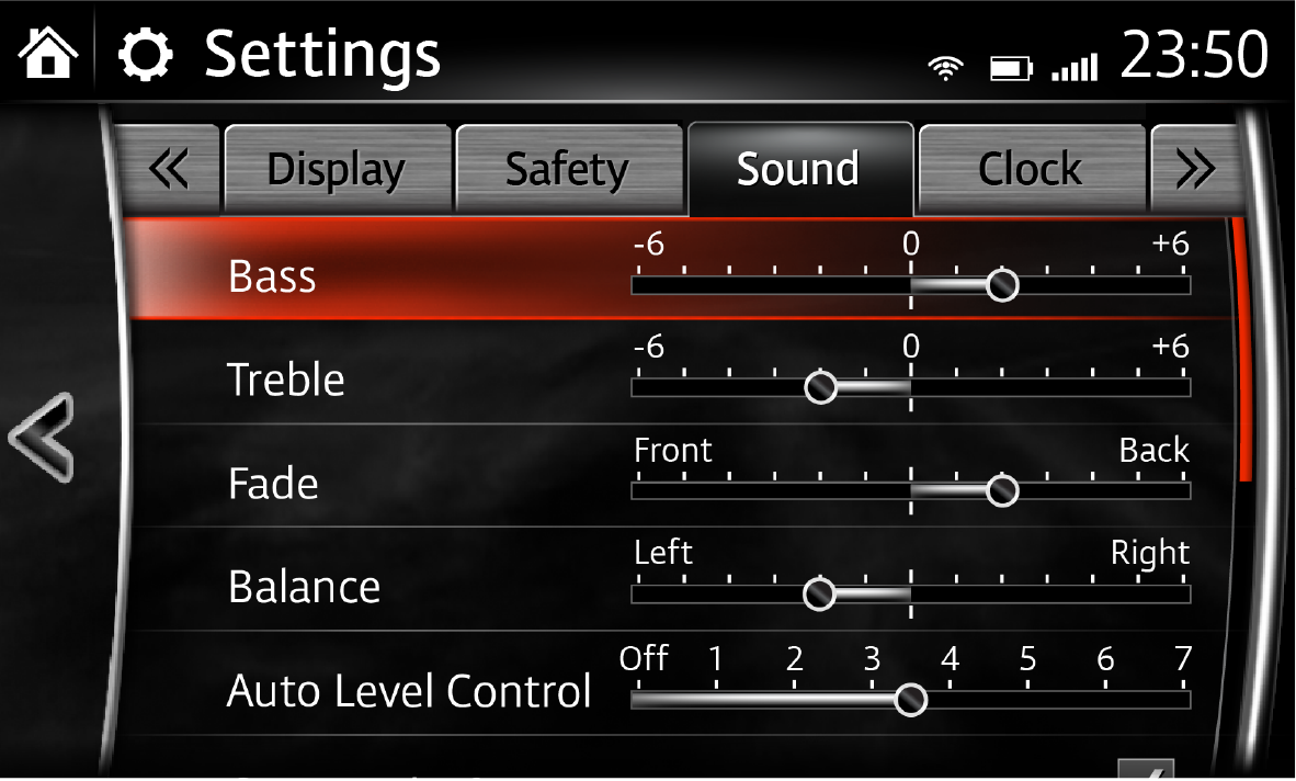
A persistent Back button is included on the left edge of all screens and the left-most button in the UMP. A hard counterclockwise spin (or left bump) will always get the user out of whatever screen they were in. A persistent Home button in the top left corner of the screen gives a easy escape for when users get too deep into the menu structure.
DICTATES INFORMATION ARCHITECTURE
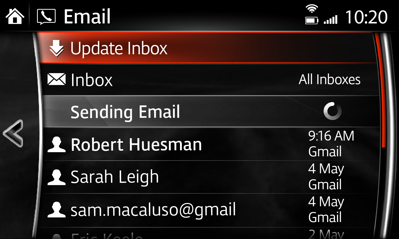
Features were sorted into the following categories: Applications, Entertainment, Communication, Navigation, and Settings. Although Settings is a top-level menu item, it can be accessed from within each feature. This shortcut makes navigating a deep information architecture easier.

POST LAUNCH
The MazdaConnect system was then proliferated across the entire Mazda line of vehicles worldwide. Updated assets for the various vehicles were provided by Mazda team then implemented by Visteon. Verbiage, selected by the Visteon studio team, was translated and validated by the regionalization team. In addition, keyboards and other text fields were optimized for Japanese, Chinese, and Arabic.
For proliferation to the Toyota Scion line (left), Mazda red was replaced with Toyota blue across the interface. To achieve this, the graphics team needed to review each control and create new production assets manually. Then, a new style guide was generated based on the updated assets and screens. The Johnson Controls design studio worked with the Fairly Painless studio to create an updated startup animation for the Fiat 124 Spyder (right). The updated Fiat animation was aligned to the animation guidelines set out in the style guide (sign of life, vehicle identification, transition).
